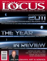
It is not a secret that I am a huge science-fiction/fantasy geek, or that I love books. So for those who are into that particular niche as well, they might not be surprised to know that I also used to read and love the magazine Locus.
 If you’ve never heard of Locus, it’s probably because you are not a science-fiction or fantasy geek. It’s a publication that mixed a lot of book reviews with interviews, event coverage, and a quarterly listing of upcoming books. I used to be enraptured by that last feature; back before Amazon and such, it was the best way to find out what books by your favorite author were scheduled. I liked the other parts of Locus, too; I learned about a lot of new books and authors through Locus, and after years of reading about events and seeing the photos, it was a minor “whoa!” moment to have my own picture appear in a gallery from the 1999 Nebula Awards.
I’d started reading Locus in the early ’90s, but after about a decade I let my subscription lapse. It was an expensive subscription for me at the time, I had a lot less free time, and I’d set aside “for the time being” writing fiction. (Something which has slowly started to inch forward again, but that’s a story for another day, since there’s not much to show for it right now.) And I will freely admit that as someone who as A Lot Of Stuff, I’ve been a big fan of having less clutter come in if it’s something that I’m not going to read promptly.
Imagine my pleasant surprise today to discover that Weightless Books is now offering electronic editions of Locus now, along with subscriptions. I just went and bought the first issue, and had it instantly sent to the Kindle app on my iPad. And so far? It feels like finding an old friend and discovering that aside from some slightly grayer (or perhaps less) hair, they’re exactly the same. We’ll see once I’ve read some more of the issue if the rest of it still holds up, but for now, I’m delighted. (Although I fear that this is just going to get me to buy more books that I will not get around to reading. At least now they just take up disk space instead of bookshelves.)
Technology, sometimes, is pretty darn fantastic. Welcome back, Locus.

 If you’ve never heard of Locus, it’s probably because you are not a science-fiction or fantasy geek. It’s a publication that mixed a lot of book reviews with interviews, event coverage, and a quarterly listing of upcoming books. I used to be enraptured by that last feature; back before Amazon and such, it was the best way to find out what books by your favorite author were scheduled. I liked the other parts of Locus, too; I learned about a lot of new books and authors through Locus, and after years of reading about events and seeing the photos, it was a minor “whoa!” moment to have my own picture appear in a gallery from the 1999 Nebula Awards.

