I’ve always found a row of matching books, lined up just so, to be extremely aesthetically pleasing. A small part of me enjoys it because of the completest gene in me (although over the years I’ve managed to beat that down a great deal), but there’s also something about the overall design sense with the series of matching spines that makes me think, “Yes, yes, that looks lovely.”
It doesn’t have to be overly ornate. For example, I’ve always liked Small Beer Press’s Peapod Classics line (which sadly only had three books and then appears to have stalled out), and not just because they’ve selected good books for the line. The cover design is simple but effective, and having Kevin Huizenga provide the cover art is an added bonus.
And to be fair, it’s not even just books. DVDs, magazines with spines, anything with a nice design sense has always been appreciated. It’s why I’ve found the Criterion Collection’s shifting from one font to another to be frustrating (and I’m not even a big Criterion geek), and why other publications have managed to stick around in my home because they look so good.
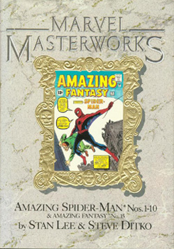
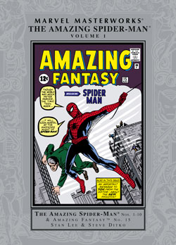
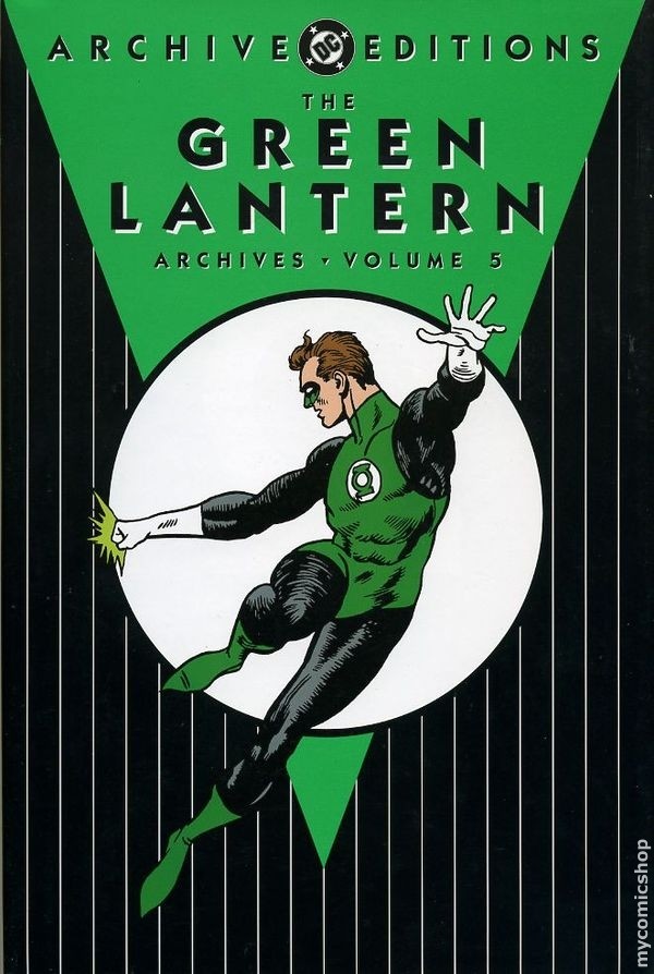
I say all this because as a big ol’ comics geek, it’s always pained me to see some truly hideous design work on what should be two of the nicest lines in comics; DC Comics’ Archive Editions, and Marvel’s Masterworks. These lines reprint the company’s oldest and most classic comics; the original runs of books like Superman, Batman, The Avengers, The Amazing Spider-Man, and so on. We’re talking about superhero comic royalty. How bad are they designed? I own exactly zero of these books.
The original Marvel Masterworks design was ghastly; a fake marble background with a foil stamped frame in the center and the artwork crammed into that small portion. They’re ugly, and while the redesign a while ago shifted to a black and silver look that isn’t as bad, it’s still not terribly attractive. The artwork is larger, so that’s good at least, but it’s still not an attractive or eye-catching look.
I’m not letting DC Comics off the hook here with their Archive Editions, though. They’re also uninspiring; a single image of a character (or sometimes a group of characters), the inverted triangle and circle, and a pin stripe background. Once again, there’s a lot of space wasted here. It’s not energetic or exciting, and they don’t make me want to buy them at all.
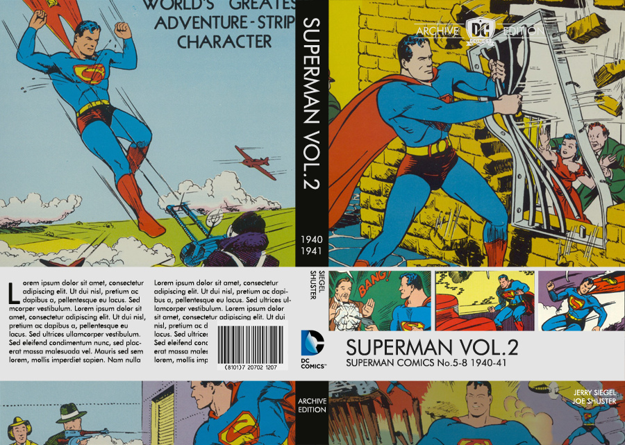
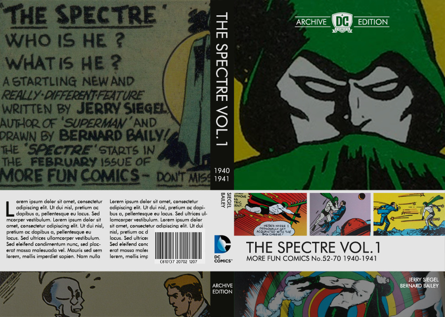
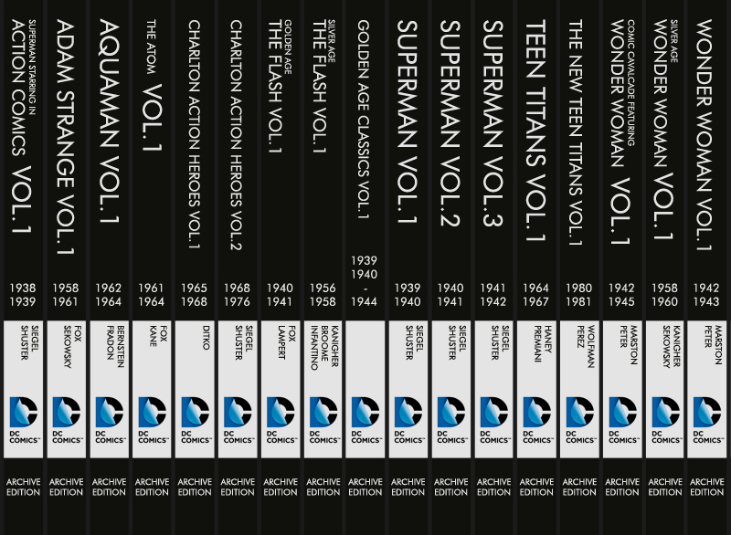
Kurt Busiek (via Dan McDaid) recently pointed out online where Jon Morris presented his ideas for a redesign of the DC Archive Editions. The entire post is here but I’ll just show you one or two of his (many) mock-ups.
These are already so much better it’s not even funny. I love the big image on the top, with room for four additional smaller ones. (Sure, the images in these mock-ups could use some brightness and contrast touch-ups, but you get the idea.) The books have room for creator names, what they reprint, additional material, and even two more images on the back. And when lined up on the bookshelf?
Well, be still my beating heart. Quite frankly? If DC announced they were redesigning the Archive Editions to look like this (plus a small, initial-orders only printing of the original design for any new ones for people who want a complete set – Marvel does this for theirs, which is a nice touch), I’d start buying the new editions. As these are expensive books, it’s probably just as well that DC shows no signs of doing so.
The sad thing is that DC does have a nice design for their black and white, low-cost Showcase Presents books. It’s simple but effective; a small band up along the top, room for an entire cover on the front, and they look nice when lined up, as seen on the top two rows on the photo below.
And who knows? Maybe someday they’ll redesign the Archive Editions line and I will finally spring for them. My bookshelves are sad that we aren’t getting them, because they sure would look nice. My wallet, on the other hand is just fine with that.
![Wall of Comic Goodness [365portraits: 242]](http://farm3.staticflickr.com/2451/3879636052_e3978920f3_z.jpg)
You probably don’t own these but the kids manga series like Pokemon and Digimon and even, I think, the Dragon Ball series have a continuous picture that runs along their spines, so they look really neat on a bookcase 🙂
I kind of like the DC Archives trade dress. I admit that it hasn’t aged well since it was first introduced in 1989 but it’s weathered 23 years of continuous use and is even one of the only places which still use the classic late ’70s DC bullet. That’s not bad.
I agree the putative design by Jon Morris is pretty fly, but I don’t know if it would make me want to buy the Archive Editions. It’s not the uninspired covers that don’t make me want to buy them– it’s the ridiculously high price tag, particularly for 1930s and 1940s editions that have large quantities of material redrawn (particularly for volumes which were “Theaksonized”).
Kathy — I do own a few of those, actually! And I adore when that happens. If anything it makes me want to buy them all that much more.
Graeme — The price tag’s definitely a big barrier. Expensive plus ALSO ugly on the outside makes it one I just can’t climb over. I hadn’t realized they still had the original DC bullet, though! That’s pretty awesome.