Back from Bogota
As hinted a few months ago, I went on a work trip to another country… namely, Colombia (in the city of Bogota). Because it was a work trip the majority of it involved watching training at a government-run facility and being driven between the facility and the hotel in an armored van. But! I did get some sight-seeing in on the weekend, including a trip to botanical gardens, a huge park, a hop up to the peak of Monserrate in a cable car to see the sun set over the city, and (best of all) a bicycle trip around the city for three hours. All in all, a lot of fun and a place I’d have almost certainly never gone to otherwise.
Bruuuuuuuuuce!
I’ve heard for years and years (you probably have too) that Bruce Springsteen puts on some of the best concerts out there. My friend John A. back in his heyday used to hit multiple stops of a Springsteen tour as it went up and down the East Coast. And now, having seen him perform on the Wrecking Ball Tour at Nationals Park in Washington DC? I get it. I totally get it. It’s funny because while I like Springsteen I am by no means an uber-fan. I don’t have half of his albums. I don’t know the words to a lot of the songs. Heck, I didn’t know half of the songs he played. But it didn’t matter. He performs every song from start to finish like it’s the last song of the night and therefore has to put all his energy into it. Just an amazing performance, and when your concert runs over three hours (who needs an opening act when you’re on stage that long?) you need to be at the top of your game. Kylie Minogue’s Aphrodite Tour might still be my all-time favorite concert, but I think this will be a close second.

Aimee Mann’s Charmer
If I remember the chronology correctly, it was right after hearing Aimee Mann’s solo music courtesy the Magnolia soundtrack (and then ordering a copy of Bachelor No. 2 online) that my friend Felicity helpfully pointed me to her earlier two solo albums. By that point I’ve been hooked. But with her last album being a little disappointing, I found myself a tiny bit wary about her new album Charmer. Then I heard the title track courtesy a hysterical video co-starring Laura Linney (seriously, I just about lost it I was laughing so hard), and NPR streamed the album leading up to the release, and all was forgiven. Sure, the second half of the album isn’t as great as the first half, but the 1-2-3-4-5 punch of Charmer, Disappeared, Labrador, Crazy Town, and Soon Enough is strong enough that the second half could have been static and I’d still be happy. (In a rarity, the bonus track I got from buying via Amazon—Brother’s Keeper—is a real bonus and just as good as the first half of the album.) In a year with a lot of disappointing albums from returning artists, this one did just what it needed to.
Adele’s Skyfall
Not to be a cliche, but I’m an Adele fan. I also like big brassy James Bond theme songs (and not just those by Shirley Bassey, but those are at the top of the list). So when I heard that Adele was performing the theme for Skyfall, I was tentatively hopeful. Could this be it? The heir to Bassey’s Goldfinger theme? As it turns out… yes. Thanks, Adele. This is just what I needed.
Double-Digit Milegage
After far too many months off due to injuries, I returned to running recently. And last weekend, I got back up into the double-digit distances again with a 12-miler. I got to run it with most of my running buddies (Ben, John, Stephanie, Steve) and not only was the company great, but I felt fantastic afterwards. No marathons on the horizon (I’m playing it safe, probably won’t go higher than 14mi for a while) but it’s nice to know that this amount is once more available.





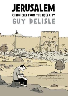 Guy Delisle’s travel graphic novels are fantastic; he’s a cartoonist who’s in the past written about taking trips for work to China (Shenzhen: A Travelogue from China) and North Korea (Pyongyang: A Journey in North Korea), as well as—thanks to his wife’s job at Doctors Without Borders—living for a year in Burma (Burma Chronicles). Jerusalem: Chronicles from the Holy City places Delisle and his family in East Jerusalem as his wife works in Gaza and Palestine. I love Delisle’s comedic tone mixed with moments of serious reflection, and Delisle does a nice job of making you feel you are there with him thanks to little details like trying to find playgrounds for the children, or going through security whenever he returns to the country after a business trip. There are a few moments that are head-scratchers (how did he not know what Yom Kippur was before moving to Jerusalem?) but on the whole I’m enjoying it a great deal. I’m reading just small chunks at a time to make it last longer; it’s been four years since Burma Chronicles so I want this experience to stretch out as much as possible.

![Wall of Comic Goodness [365portraits: 242]](http://farm3.staticflickr.com/2451/3879636052_e3978920f3_z.jpg)

