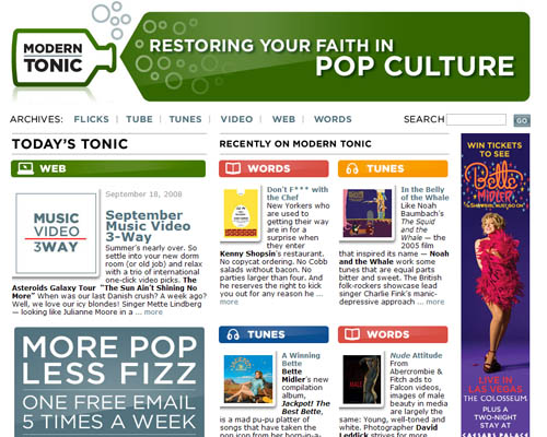
At my job I see a lot of web design—both our own and others. And maybe it’s just me, but more and more as of late I’ve been seeing what I’m starting to think of as “cramped” web pages. You know, where you shove everything and the kitchen sink onto a page.
So with that in mind, kudos to Modern Tonic for having a really nice, simple, and open web page. They send out a free email each weekday featuring entertainment reviews, with the archives available on their website. And honestly? I just signed up for their email based entirely on their design asthetic.
(I’m sure this is connected in some part to the dichotomy I’ve learned to recognize in myself as of late; I read descriptions of tiny homes in Haruki Murakami’s Norwegian Wood and wish for that life to be my own, but struggle to get rid of my gazillions of possessions. Is it the attraction of what I’m not?)
